There's a quiet moment before every send. The build is done, the client has signed off, the campaign is loaded — and then there's the last look I always do. Not for how the email looks, but for the small mechanical things that quietly break in the inbox and never show up in a preview.
I've done that last look thousands of times over the years. At some point it stopped being a checklist and became muscle memory — the same handful of things I check without really thinking about them. Not always in the same order; what matters is that none of them get skipped. Recently I did something I'd never gotten around to before: I actually wrote it all down. And then I turned the mechanical part of it into a small, open-source tool anyone can run, and put it out in the open.
This is a note about what's in it, why those specific checks, and why I decided to share it. If you'd rather just look at the code, it's on GitHub — email-html-qa-skill. Otherwise, here's the thinking behind it.
The thing that took me a long time to fully make peace with is this: an HTML email will never look identical everywhere, and it isn't supposed to. You're not shipping into one browser you control. You're shipping into Gmail, Apple Mail, Outlook on Windows, Outlook on Mac, iOS, Samsung Mail — each with its own rendering quirks, its own idea of dark mode, its own way of quietly rewriting your code.
So the goal was never pixel-perfect. The goal is robust and graceful. An email that survives an unpredictable rendering environment and still reads clearly — that's the win. Something that looks flawless in one client and collapses in the next is a worse email than something that's a little plainer but holds together everywhere.
Most of what breaks an email doesn't break because the design was wrong. It breaks because of something small and mechanical that got missed on the way out the door.
When I look back at the things that have actually caused problems in production, almost none of them were exciting. They were things like:
An email that crept past Gmail's clipping threshold — around 102KB — so Gmail cut it off partway down and hid the unsubscribe link under a "view entire message" link a lot of people never click.
A missing alt attribute on an image, so a subscriber with images off, or on a screen reader, gets nothing where a headline should be. And the reverse — a decorative image that should carry an empty alt="" so a screen reader skips it, rather than reading out a filename.
An image with no link, especially a large one. The eye reaches an image before it reaches the copy, so in an email an image is effectively a call to action whether or not you meant it that way — a hero or product image without a link is a missed click. A large unlinked image isn't neutral in Gmail either: Gmail wraps it in its own lightbox and pops it open when someone taps, instead of taking them where you'd want them to go. Linking the image solves both at once — it catches the click, and it takes that decision away from the client. (Google doesn't publish the size that triggers the lightbox, so the safe rule is simply to link your images.)
A layout table without role="presentation", which reads to assistive technology as an actual data table instead of the invisible scaffolding it's meant to be.
A placeholder # link that never got swapped for the real URL, sitting quietly in the footer.
A missing charset, so a curly quote or an em-dash turns into mojibake the moment it hits certain clients.
A preheader nobody set, so the inbox pulls in whatever text happens to come first — often "View in browser" or a stray line of code.
And then dark mode, which deserves its own conversation, because it's the least predictable of the lot: a logo that vanishes on a dark background, a button whose colour gets inverted into something unreadable, text that loses its contrast entirely. The client decides how dark mode gets applied, not you, so part of the job is checking how your email behaves once they've had their way with it.
The vanishing logo is one I wanted the process to catch on its own. It flags transparent logos and social icons that sit on the background with nothing behind them — the exact assets that sink into a dark inbox — so you see them before the send and can go back to design for a fixed version rather than finding out from a subscriber. That part is a reminder, not a guarantee: the client's rendering still has to be seen in a real dark-mode proof. But a flag before the send beats a surprise after it.
None of these are hard to catch. They're just easy to miss, because they don't show up when you glance at the email and think "looks good." You have to go looking for them specifically. That's exactly the kind of thing a machine should be doing for you.
So the tool has two layers, and they do different jobs.
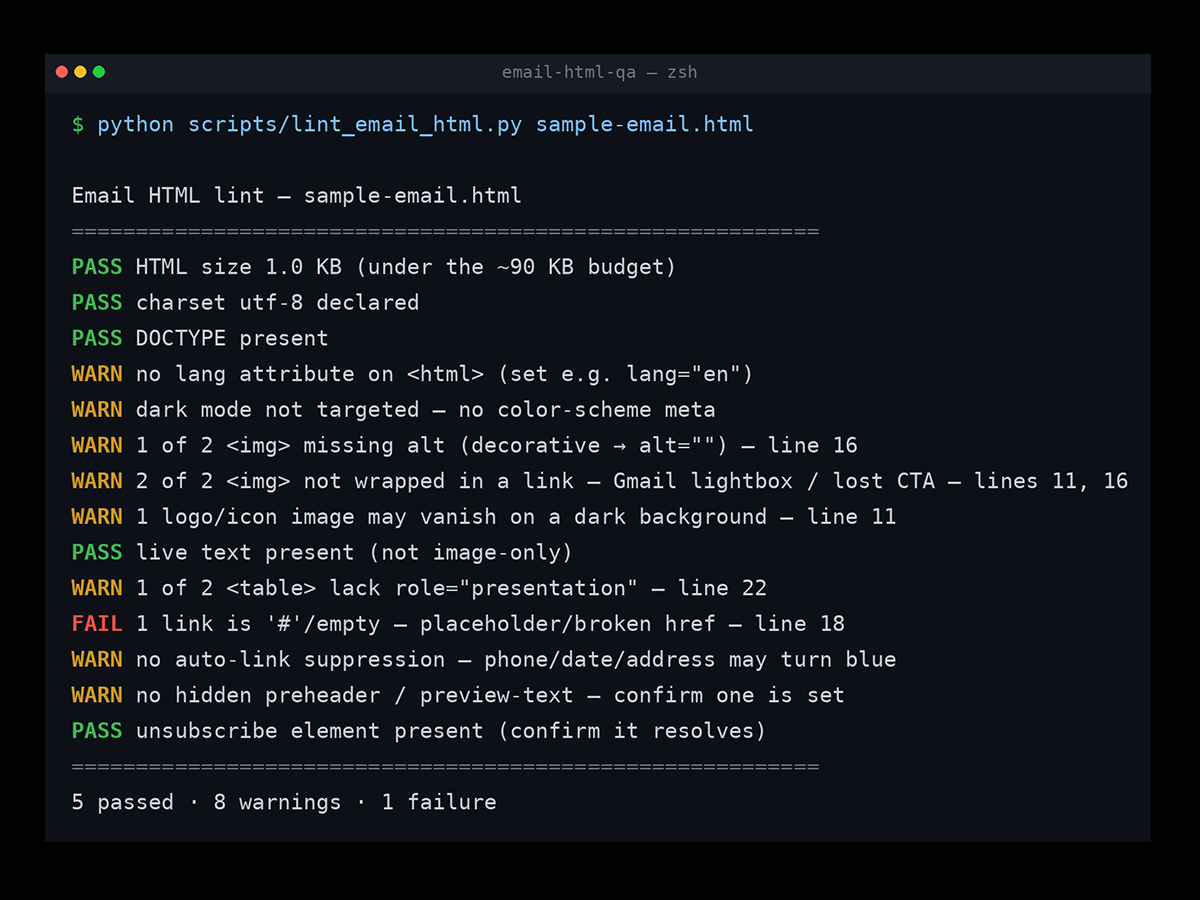
The first is a small linter — a plain script with zero dependencies that you point at an HTML file. It runs through the mechanical checks and reports each one as PASS, WARN, or FAIL, with line numbers where it can point you to the exact spot. Size and clipping, charset, alt attributes, role="presentation", empty and placeholder links, whether a preheader and an unsubscribe element are present. The boring stuff, caught cheaply, in a second or two.
I built it to report the passes too, not just the problems — because "here's everything that's fine, and here are the three things to look at" is a much calmer way to start a QA pass than a wall of red.
The second layer is the human one: the full checklist of things that need judgment, not just detection. How the email renders across the real clients. How it holds up in forced dark mode. Accessibility beyond the mechanics. Whether the personalization has sensible fallbacks. Whether the CTAs actually go where they should. That part isn't automatable, and it shouldn't be — it's the craft.
The way I think about it, the linter is mise en place. It clears the small, mechanical things off the board so that when you sit down to do the real review, your attention is free for the parts that actually need a human. You're not burning focus checking for missing alt tags by hand. That's already done.
There's one distinction in here I care about more than it might first appear, because it's easy to get wrong.
The tool checks that a compliance element — an unsubscribe link, for instance — is present and functional. What it deliberately does not do is tell you whether your footer satisfies the law. Compliance footers vary between industries and between countries, and the specifics of what has to be there, and how, is something you set with the client at the start of a project — not something a linter can decide for you.
So the check is honest about what it is: it verifies the mechanics. Is the element there? Does the link resolve? The question of whether it's legally sufficient for a given audience lives with the client and their counsel, and it gets defined at kickoff. I'd rather a tool be clear about that boundary than quietly imply it's checking something it can't.
That same principle runs through the whole thing: verify the mechanics against what was specified. Don't pretend to certify what you're not in a position to certify.
Being clear about scope is part of what makes a small tool useful, so I was deliberate about it.
This is HTML and CSS craft — rendering, dark mode, accessibility, code hygiene, and confirming the specified elements are present and work. It is not deliverability or authentication — SPF, DKIM, DMARC, domain warming, spam scoring all live with your ESP and your deliverability setup. It's not ESP campaign configuration. And it's not legal or regulatory certification. Those are all real and important, and they belong to other people and other tools. A pre-send QA pass on the code is one layer of the stack, and it works better when it knows which layer it is.
None of this is groundbreaking. It's the kind of checks I've accumulated from years of production work — the unglamorous layer underneath the design that decides whether an email actually holds up once it leaves your hands. I just finally wrote them down in a form other people can use.
And the list is still growing. I pushed six more commits to it while writing this article — every time I described a check, I thought of another one worth adding. That's the quiet upside I didn't expect: this small tool is already scaling, and it relaxes my brain at the same time. Once a check lives in the script, it's one less thing I have to hold in my head before every project hand-off.
I put it out under the MIT License, in the open, because this is the kind of thing the email community has always been generous with, and I've benefited from that generosity plenty. If it saves someone a clipped send or a broken footer, that's a good outcome.
I'd genuinely love feedback, or PRs, from other email people — the render quirks change over time, everyone's production reality is a little different, and a checklist like this only gets sharper when more people who do this work poke holes in it.
Update (September 2026):
It now covers the other half of the job too — checking a message after it's sent. A companion script reads the authentication results a mailbox provider records on delivery (SPF, DKIM, DMARC), confirms the List-Unsubscribe and one-click headers are in place, and takes a best-effort guess at the sending ESP. Same philosophy throughout: it reports what the receiver already recorded, it doesn't diagnose or fix deliverability — that stays with your ESP or a specialist. Thanks to a deliverability specialist whose steer shaped this part.
The QA skill and the linter are on GitHub — github.com/EmailBoutique-Digital-Inc/email-html-qa-skill. Rendering and dark-mode engines change over time, so treat client-specific behaviour as time-sensitive and re-verify.
📩 Connect with me on LinkedIn or send a message.
With Love from Vancouver, Canada
Annett
Founder, EmailBoutique.io