In the first part of this series, Dark Mode in Email: What Really Happens (and How to Deal With It) - Part I, we looked at how email clients force overrides, apply automatic inversions, and introduce inconsistencies you can’t fully control.
Now we move upstream.
Because dark mode is not a coding problem first.
It’s a design stability problem.
If visual assets collapse under contrast shifts, no amount of CSS will fully rescue them.
So here’s how to prepare for dark mode — directly inside Figma.
For email design specifically, Figma has a clear advantage over tools like Photoshop.
Email layouts need to be reviewed and approved in both desktop and mobile views. In Figma, you can design responsively using frames, auto layout, and component systems — all within the same file. You can quickly toggle between desktop and mobile widths, test spacing, and validate hierarchy without rebuilding anything from scratch.
Photoshop is pixel-based and static. It wasn’t built for structured, responsive systems. Managing multiple breakpoints, reusable components, and scalable design systems becomes inefficient very quickly.
For email — where structure, spacing, and modular systems matter more than complex image manipulation — Figma is simply more aligned with how emails are actually built.
But that’s a topic for another post.
You don’t need to design two separate emails.
And you don’t need to test the full layout yet.
Start with the visual assets.
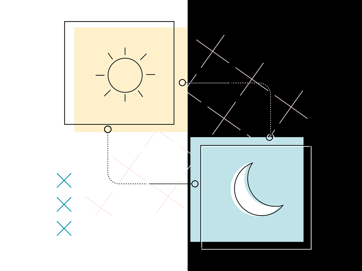
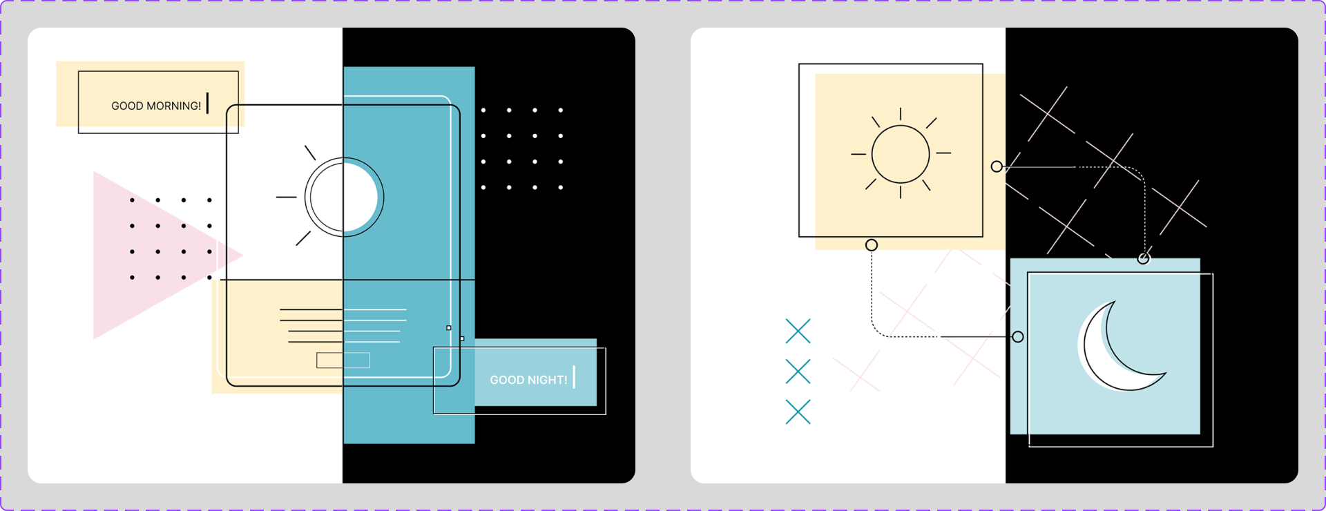
Inside your Figma file, create light, dark, and medium grey background layers that can be toggled on and off. Think of them as contrast testing panels.
Then place your individual assets on top:
The asset stays the same. Only the background changes.
This immediately reveals whether your visuals are stable across environments.
You can quickly:
You are not redesigning anything.
You are stress-testing each asset in isolation.
Because if a visual doesn’t survive on both light and dark backgrounds on its own, it definitely won’t survive once it’s embedded inside a full email layout.
Optimizing assets first makes everything downstream — layout, code, testing — significantly more predictable.
You’re not duplicating work.
You’re preparing your assets for environmental shifts before the email client does it for you.
Think of it as mise en place for email design.
Now that the assets are stress-tested, let’s look at where things usually break first.
Illustrations are often the first elements to fall apart in dark mode — especially when they include transparent backgrounds, thin lines, or subtle tonal contrast.
To test this, I placed the same illustration on toggleable background layers in Figma (light vs. dark) and adjusted the artwork until it held up in both.
Because the background may change dramatically, we can’t assume the canvas will stay light or dark.
Instead of designing for one background, I reinforced the illustration to survive multiple environments:
Some of these changes look unnecessary in light mode.
That’s the point.
They’re not for light mode. They’re for survival when the background flips.
In email, dark mode is not a theme — it’s an override.
We have two choices:
When the background is unstable, the artwork must carry its own structure.
Smaller elements introduce a different kind of instability.

Icons may be small, but they’re extremely sensitive to dark mode behavior.
Without structural support:
And then there’s another complication.
Some email clients — especially Samsung’s native app — will invert some icons but not others.
Samsung uses heuristic-based dark mode rendering.
It doesn’t “know” what your icon is. It analyzes the image and makes a decision based on patterns like:
Two nearly identical icons can behave differently simply because one has transparency and the other has a solid background.
This is algorithmic interpretation — and we don’t control it.
To reduce unpredictability, I made each icon more self-contained:
When an icon carries its own structure, it’s less vulnerable to forced inversion.
Small design decisions.
Big stability gains.
Now let’s talk about the most sensitive asset of all.

Logos are often non-negotiable.
You can’t adjust letterforms or stroke weights just because dark mode is unpredictable.
When backgrounds shift:
The logo itself may stay untouched — but its environment changes.
Provide Light and Dark Versions
Most brands already have a standard and a reversed logo. Always prepare both.
Keep in mind: switching between them is mainly supported in native apps like iOS or Samsung Mail. Not every email client will reliably swap logos.
Create Structural Protection (If Approved by the Brand Team)
If swapping isn’t reliable, protect the logo structurally:
These additions don’t alter the logo — they reinforce visibility when backgrounds shift.
Strengthen Contrast Around It
Adjust the surrounding tone behind the logo to ensure strong separation without modifying the brand asset itself.
We’re not redesigning the brand.
We’re protecting it.
Dark mode in email is inconsistent across clients.
You are not designing for one perfect state.
You are designing for:
That means:
Design for durability.
This is a lot — I know.
As designers, we want to get everything right. We care about the details. We’re proud of what we create.
But once an email leaves your design file, it enters an environment full of limitations and inconsistent rendering. The developer working with your assets navigates those constraints every day.
The best thing we can do is collaborate.
Understand each other’s challenges.
Keep the client and subscriber experience at the center.
It’s not about perfection.
It’s about clarity, accessibility, and making it work for everyone.
If you’d like to see how I handle dark mode in real projects, feel free to book an intro session with me.
📩 Connect with me on LinkedIn or send a message.
With Love from Vancouver
Annett
Founder, EmailBoutique.io