Dark mode in email is one of those topics that looks simple on the surface—and turns out to be anything but.
Yes, dark mode was introduced with accessibility in mind. Reducing eye strain, improving readability in low-light environments, saving battery life—these are all valid and important benefits.
But email dark mode is not a single, predictable feature. It’s a collection of interpretations, overrides, guesses, and sometimes outright chaos—depending on the email client, device, and operating system.
That’s why dark mode needs to be considered before designing layouts or writing a single line of email code.
Before colors, before layouts, before components, there’s one essential question to answer:
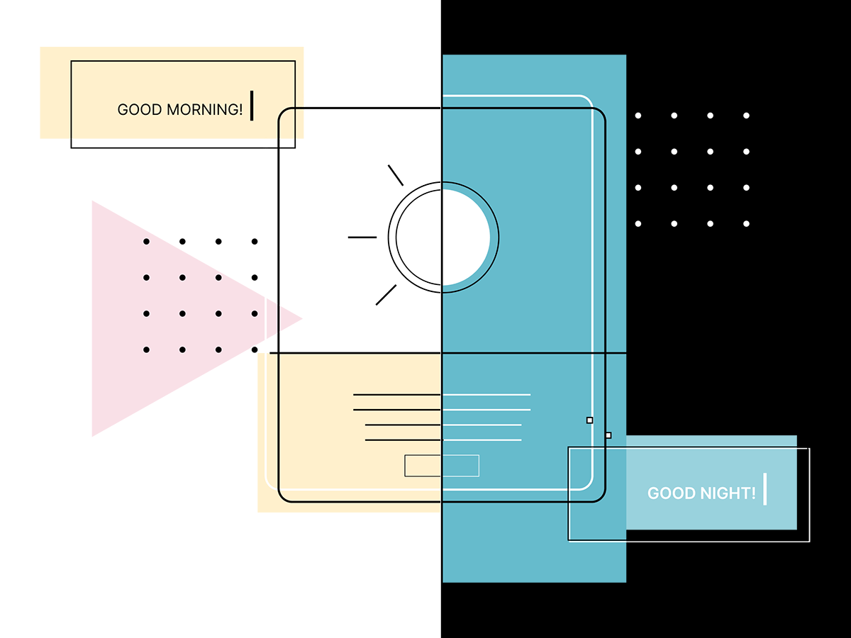
What happens to a brand when an email client decides to “help”?
Because that’s exactly what dark mode does in many email apps—it forcefully adjusts colors. Sometimes intelligently. Sometimes aggressively. Sometimes destructively.
This is especially critical for brands with:
If dark mode isn’t addressed early, it turns into a firefight later.
One of the most underestimated aspects of dark mode: it is wildly inconsistent across platforms.
Apple Mail is the most respectful client when it comes to dark mode.
prefers-color-schemeThis is where clean, intentional dark mode design is actually possible—and the reason many dark mode techniques exist at all.
Gmail on iOS is… complicated.
prefers-color-schemeThis is where strategy starts to matter more than visual perfection.
This is where things get spicy.
Gmail on Android aggressively transforms emails:
This behavior is not optional. Gmail decides.
So instead of fighting it blindly, the only workable approach is to understand and design around its transformation logic.
Outlook deserves its own category.
This is where defensive coding matters more than “perfect” design.
One of the most common issues in dark mode emails:
A dark logo on a transparent background that looks great on white—and completely vanishes in dark mode.
This isn’t a design mistake. It’s a mismatch between branding assumptions and email reality.
Dark mode doesn’t know what a logo is supposed to do. It only sees pixels.
There is no single “magic” dark mode solution. What works instead is controlled behavior.
That means:
Sometimes that means:
This isn’t about hacks for the sake of hacks. It’s about reducing surprises.
Dark mode is no longer a “nice-to-have.” It’s a real user context.
But it’s also not something that can be fully controlled.
That’s why expectations matter:
This isn’t about doing dark mode “the right way.”
It’s about choosing an approach that aligns with the brand, the audience, and the technical reality of email.
Dark mode is not a switch. It’s a negotiation.
Every email client gets a say. The goal is to make sure the brand still shows up clearly—no matter who’s holding the microphone.
And that’s why dark mode always comes first.
📩 Connect with me on LinkedIn or send a message.
With Love from Vancouver
Annett
Founder, EmailBoutique.io